The Process
Follow along as I share the behind-the-scenes renovation process of my favorite 1942 Collier Hills cottage.
.jpg)

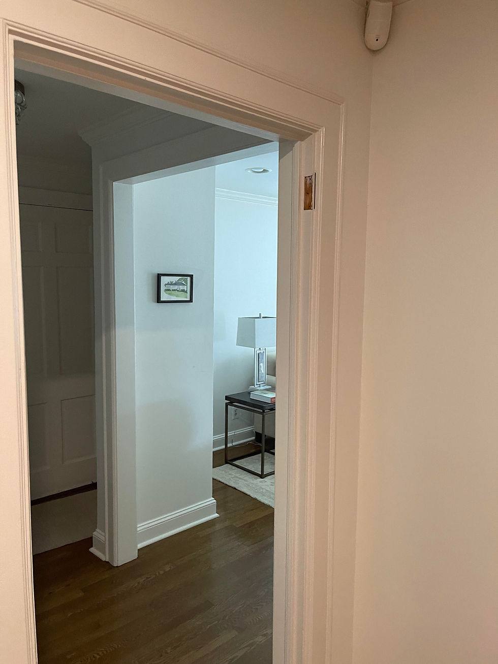
First up: the front entry. The original 1942 layout featured a classic vestibule wall that blocked half the front door, along with an old cased opening that isolated the guest wing. Together, they made the front living area feel tight and cut off from the rest of the house. Mission number one was to tear down those barriers, open up the sightlines, and give the home the welcoming, airy entrance it deserved.
By widening the hallway door and refreshing the trim work, the whole flow of the house shifted. Expanding openings did wonders, instantly connecting the space and making the entire transition feel incredibly open and effortless.




Next up was the combined pantry and laundry room. The joy of an older home is dealing with limited footprints, so maximizing every square inch was critical. I swapped out the old setup for a shallow, stacked LG washer and dryer to save space, then designed custom shelving tailored to exact everyday needs—from a designated bottom spot for the dog food container to specific heights for wine bottles, wicker baskets, and glass jars. Finally, I banished the original pull-string light bulb for a modern, functional light switch. Talk about an immediate upgrade.


I loved the kitchen from the start—it had great bones and didn’t need a total overhaul, just some intentional refinement. Design is all about how a space makes you feel, and the first thing I noticed was that the island pendants were hung too low. If you were standing at the counter, you’d be looking right into a fixture! I simplified the view by swapping them for three discreet recessed lights. In a compact footprint, less is sometimes more; this single change immediately opened up the sightlines.
Next, I traded the bulky, outdated hardware for elegant, delicate knobs and pulls that let the fabulous cabinetry shine.
For appliances, a sleek Fisher & Paykel suite was chosen that felt timeless rather than overtly modern. In a smaller kitchen, the dainty knobs on the range are a dream—they do their job beautifully without demanding all the attention.
The Breakfast Nook
There is nothing quite like a cozy breakfast nook for morning coffee and emails. To make this corner feel both inviting and elevated, I designed a custom banquette with a gathered skirt for a touch of traditional age, then paired it with a sleek tulip table for a bit of modern contrast. Finished with newly upholstered antique chairs—chef's kiss!
Finally, given our close-knit neighborhood lots, café curtains provided the perfect solution: essential privacy without sacrificing a drop of beautiful natural light.


Functionality first!
The main family room was already a great size and offered a direct path to the backyard, but the original door layout felt completely wrong for the room’s traffic pattern. To fix this, I selected a pair of classic 12-pane glass French doors to inject some architectural character while preserving the view. By designating the left door as a fixed panel and the right as the active entry, the room's flow has been completely optimized. Now, you can step straight out to the backyard without cutting into the main seating arrangement.
.jpg)

Mortise locks are absolute magic—they anchor a home to its original era and carry so much beautiful history. One of my favorite features of this house was the original unlacquered brass hardware found throughout. After a few blisters from polishing absolutely every single piece by hand, reinstalling the restored antique brass against newly painted doors completely transformed the entire house.
I also specially sourced antique floor vents to replace the tired, dated ones that came with the home. Rather than trying to hide them, area rugs were designed around these architectural works of art to intentionally highlight the detail.
Beauty is always in the details.
Growing up, I was taught that a bathroom should never be an afterthought. In fact, they are my absolute favorite spaces to design. A smaller footprint is the perfect canvas for high-impact patterns, bold colors, and unexpected prints. Plain, utilitarian bathrooms are out—spaces rooted in rich personality will always be in.

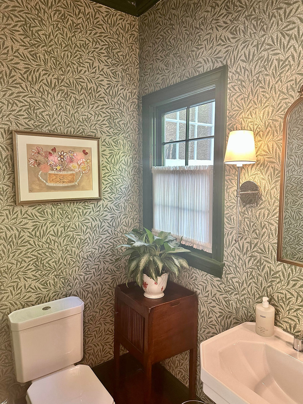
Both the guest and powder bathrooms possessed incredible bones. In the guest bath, I was absolutely obsessed with the original black-and-white tile—it was an absolute must-keep. To complement its historic charm, I paired it with sleek, modern fixtures and an antique mirror for the perfect tension between old and new.
For both spaces, I selected striking wallpapers to instantly inject warmth and character. In the powder room, we took it a step further with a rich, high-gloss trim and ceiling, alongside my favorite feature: a beautifully funky toilet and sink styled after 1930s design. Finally, a sheer curtain was added to offer essential privacy without compromising a drop of precious sunlight in the compact space.
.jpg)

Bathrooms,a love story.




The primary bathroom was my greatest layout challenge, but it yielded the most magical transformation. The original space was weighed down by dated painted tile, an oversized vanity, restrictive shutters, and a massive jacuzzi tub that overwhelmed the room. I opted for a full down-to-the-studs renovation—centering the entryway, reconfiguring the layout, and tripling the size of the shower.
I introduced fresh tile, a streamlined vanity, and classic, elevated mirrors and sconces. One of my favorite design solutions here was utilizing a glass block window inside the shower. Often labeled as a dated feature, it became the ultimate design hack to flood the space with natural light without compromising an ounce of privacy. To finish the room, I paired whimsical Sister Parish wallpaper with antique furniture to ground the new space with warmth and soul.
The Textile Edit
Once the dust settles, the real magic begins. Below is an inside look at how I concept each space, honoring a cohesive thread for the entire home while giving every room its own distinct personality. Pulling inspiration from everywhere I go, this is where my mood boards and material schemes come to life.


